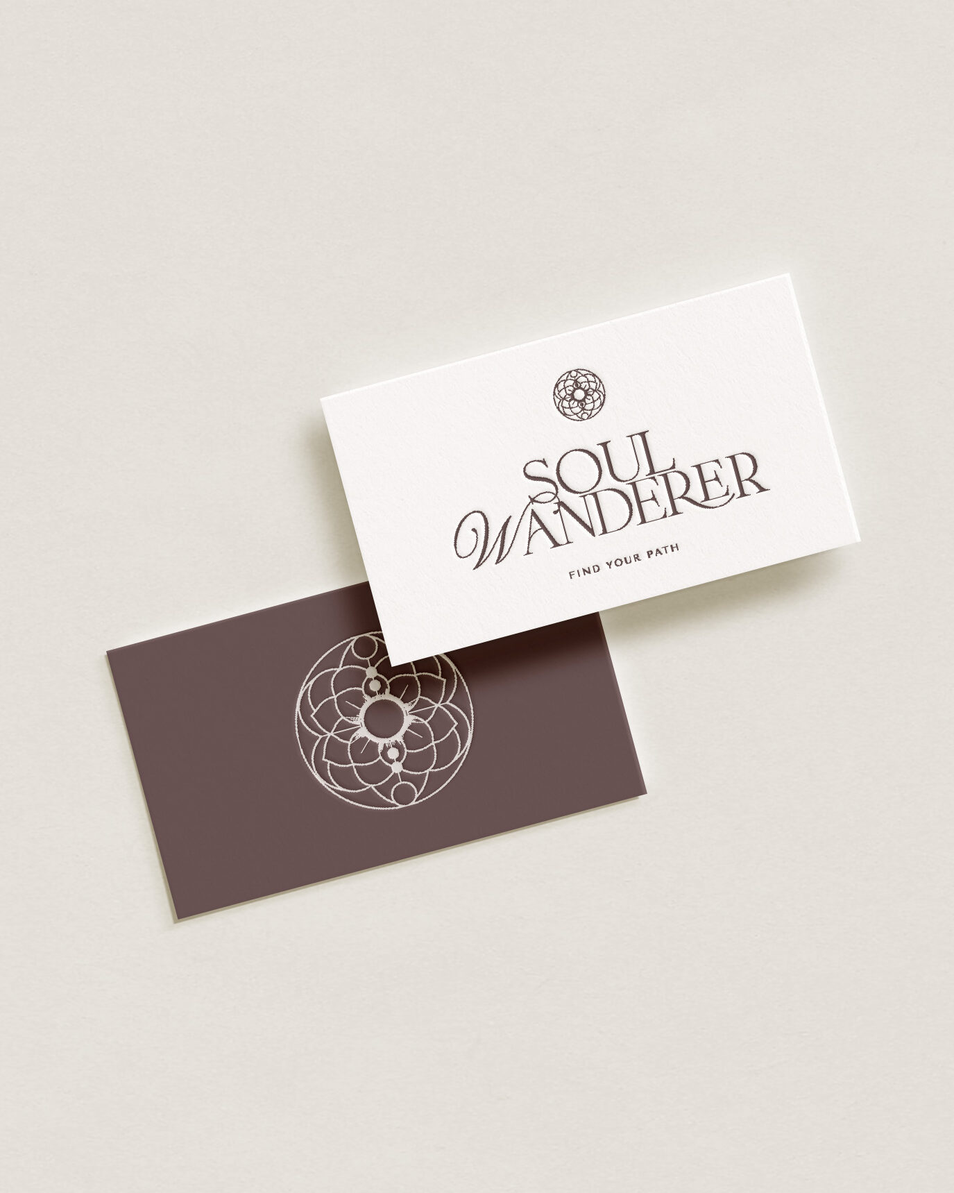
I know a lot of entrepreneurs are struggling with pairing fonts. That's why I have created this step-by-step guide to pairing fonts for you. If you are doing your own design and branding for example in Canva, these tips might be helpful for you.
Step 1: Define the Brand’s Personality
Start by defining the brand's personality. For an ambitious female founder, the brand might be dynamic, innovative, and empowering. This personality should guide the font choices, influencing whether they should be bold, elegant, modern, or playful.
Step 2: Choose a Primary Font
Select a primary font for major headings and titles. This font should strongly reflect the brand's personality. For a professional and powerful look, consider a serif font like Playfair Display or a sans-serif like Roboto. This font will set the tone for your brand, so choose one that stands out and aligns with your brand’s identity.
Step 3: Choose a Complementary Secondary Font
Select a secondary font that complements and balances the primary font, used for subheadings and body text. Ensure this font is more understated and legible at smaller sizes. If your primary font is ornate or distinctive, choose a simple and clean secondary font.
Step 4: Limit the Number of Fonts
Keep the number of fonts to a maximum of two or three to maintain clarity and cohesiveness in your design. Using more can make your brand look disorganized and confuse the visual hierarchy.
Step 5: Consider Font Weights and Styles
Experiment with different weights (e.g., bold, regular, light) and styles (e.g., italic, uppercase) within the same font family to add variety and interest to your designs without cluttering them with multiple fonts.
Step 6: Ensure Legibility
Always ensure that your text is legible across all sizes and media. Test your fonts on different devices and printed materials to make sure they are clear and easy to read.
Step 7: Contrast is Key
Aim for a good contrast between your chosen fonts. Pairing a serif with a sans-serif is a common practice that provides visual interest and guides the reader’s eye through the content.
Step 8: Test and Get Feedback
Once you've paired your fonts, create some mock-ups to see how they look in actual use, like on a website or in print materials. It’s also beneficial to get feedback from others, especially potential customers, to see if the fonts effectively convey the brand's values and essence.
Things to Avoid
Overlapping styles: Avoid fonts that are too similar to each other; contrast helps in making the content more readable.
Too many fonts: Using more than three fonts can make the design look chaotic.
Ignoring context: The context in which the text appears is crucial. For example, what works on a website header might not work in a detailed product description
I hope this step-by-guide to pairing fonts was helpful. I do offer a font pairing service, it's just not live yet.
Reach out if you want to know more!
Share this story
